Dashboard: priorities across all projects
How to read Miraqo's Dashboard — Action Centre, projects table, ∆ columns, view modes and active tasks.
The Dashboard is Miraqo’s home: a single view of all your projects, designed to understand in seconds where you need to act today. It’s different from the Overview, which is the dashboard for an individual project.
Action Center
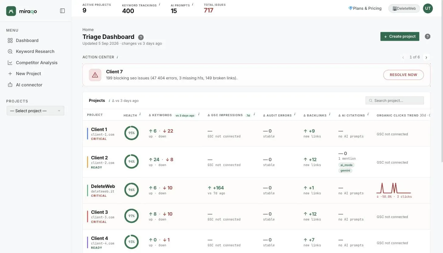
At the top of the page, when at least one project requires attention, the Action Center appears: Miraqo lists all critical projects, sorted by severity, based on a combination of:
- critical errors from the latest audit
- organic traffic drops (GSC)
- keywords falling in position
- other recent negative changes
Each card explains what the problems are, not just how many: audit criticalities are broken down by type (e.g. “54 blocking SEO issues (32 404 errors, 12 missing titles, 6 missing H1s, 4 broken links)”), so you know exactly where to start.
When there is more than one critical project, use the ‹ › arrows (with the “1 of N” counter) to scroll through the cards. The Resolve now button opens directly to the Overview of the project shown. If you don’t see the Action Center, no project is in a critical state.
Active tasks
Next to the + Create project button, a yellow “⏳ N active tasks” chip appears when there are active async operations (audits started, GSC/GA4 syncs, backlink snapshots). The counter aggregates all projects.
Projects table
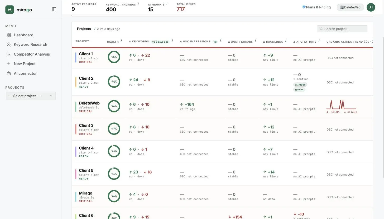
The heart of the Dashboard. One row per project, one column for each key signal. The ∆ columns compare the most recent detection with the previous one in the period indicated by the chip at the top (∆ 3 days or ∆ daily — depends on the plan chosen).
| Column | What it shows | Where it goes on click |
|---|---|---|
| Project | Name, domain, status (Ready / Attention / Critical) | Opens Overview |
| Health | Coloured ring 0–100 with SEO Audit score | Opens SEO Audit |
| ∆ Keywords | Keywords that rose (↑ green) and fell (↓ red) | Opens Keywords page |
| ∆ GSC Impressions | Impression difference vs 7 days ago | Opens GSC Data (requires GSC connected) |
| ∆ Audit Errors | Critical error variation between last audit and previous (or 1st audit if no comparison) |
Opens SEO Audit |
| ∆ Backlinks | New or lost links in the period | Opens Backlinks |
| ∆ AI Citations | Variation in brand mentions in AI responses, with source chips that mention you | Opens AI Visibility |
| Organic Click Trend | 30-day GSC click sparkline + % month-on-month | Opens GSC Data |
“Dimmed” cells (light grey) indicate values that don’t contribute to the project’s critical state: use it as a visual filter.
Project status
The label below the name summarises health:
- Ready — no active criticalities
- Warning — yellow/orange audit
- Critical — red audit or significant negative changes (the row is highlighted)
Quick search
Top right of the table, the Search project… field filters on the fly by name or domain.
Actions menu (⋮)
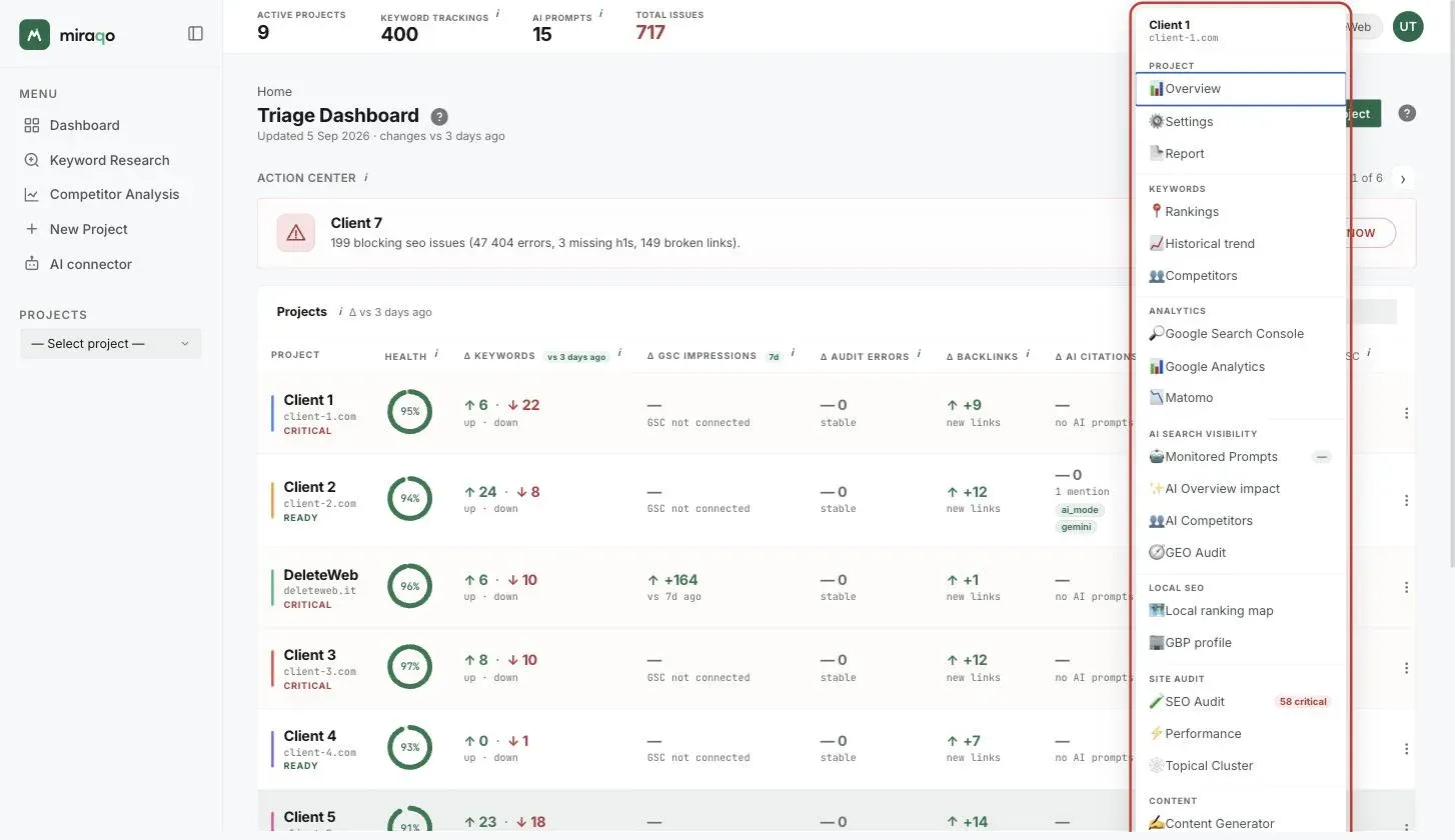
At the end of the row, the three-dot button opens a quick menu to jump to SEO Audit, Backlinks, AI Report or other project sections without going through the Overview.
View mode
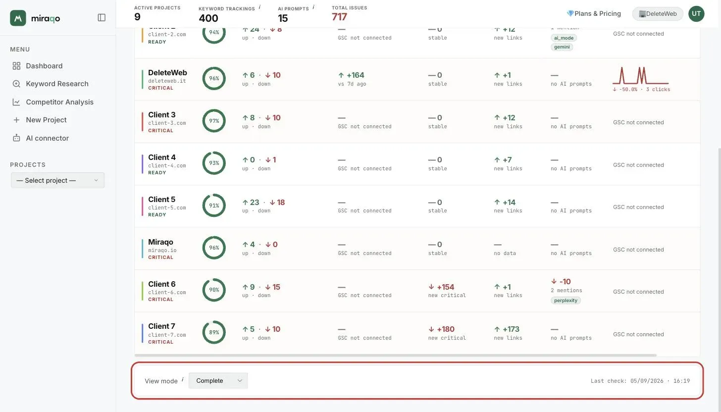
Below the table you’ll find the View mode selector, which changes the detail level:
- Complete — all ∆ columns visible. Default view for daily triage.
- Critical focus — highlights only rows with negative changes or critical errors; useful when you have many projects and want to immediately see who has problems.
- Trend only — hides ∆ columns and keeps the GSC click sparkline visible; useful for an “at a glance” look at the trend without operational details.
The choice is remembered in the browser: when you return, you find the view you use most.
Update frequency
The “∆ 3 days / daily” label below the title depends on the frequency chosen when subscribing (see Create your first project). The frequency applies to all projects in the organisation and also determines which two checks the ∆ columns compare.
When a project doesn’t appear
- The project was just created and has no comparable data yet → in the ∆ columns you’ll see
—orno data - You’ve never run the first audit → the Health ring shows
— - GSC isn’t connected → the
∆ GSC Impressionscolumn and sparkline showGSC not connected
In all these cases the row stays visible: the Dashboard also signals projects to configure, not just those with problems.
Next steps:
Last updated: 5 September 2026