The project Overview
How to read the Overview page — the single project dashboard with AI Search, key metrics, keyword ranking, analytics, backlinks and agenda. All widgets are reorderable.
The Overview is the first page you see when you open a project: a widget dashboard that collects at a glance the SEO health of the site. Each card links to the corresponding detail section via the Detail → link (or View full report → on the large panels).
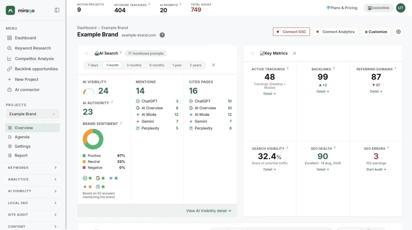
Single project dashboard ≠ Triage Dashboard (which shows all your projects together).
When data is available
The Overview populates as data arrives. Some charts (position trend, traffic trend) appear only after at least 2 ranking checks, so on a newly created project it’s normal to find “Insufficient data for chart” and “Visible after at least 2 checks”. Backlink and analytics cards remain empty until you start the first analysis or connect a provider.
Reordering widgets
All widgets are draggable: hold them on the handle and move them to build your own layout. The arrangement is saved per user (not global to the project), so each team member can have their own preferred order.
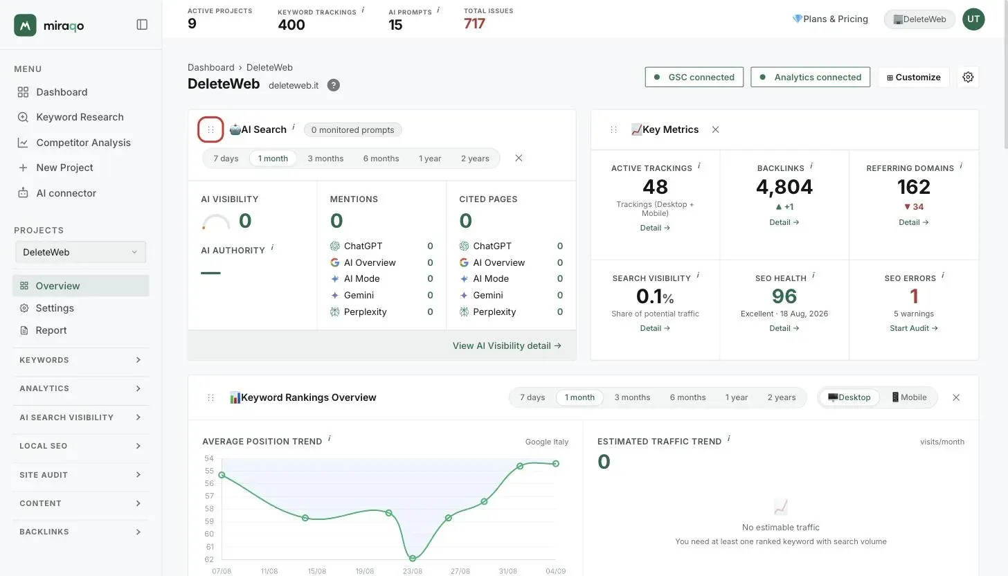
The Overview cards
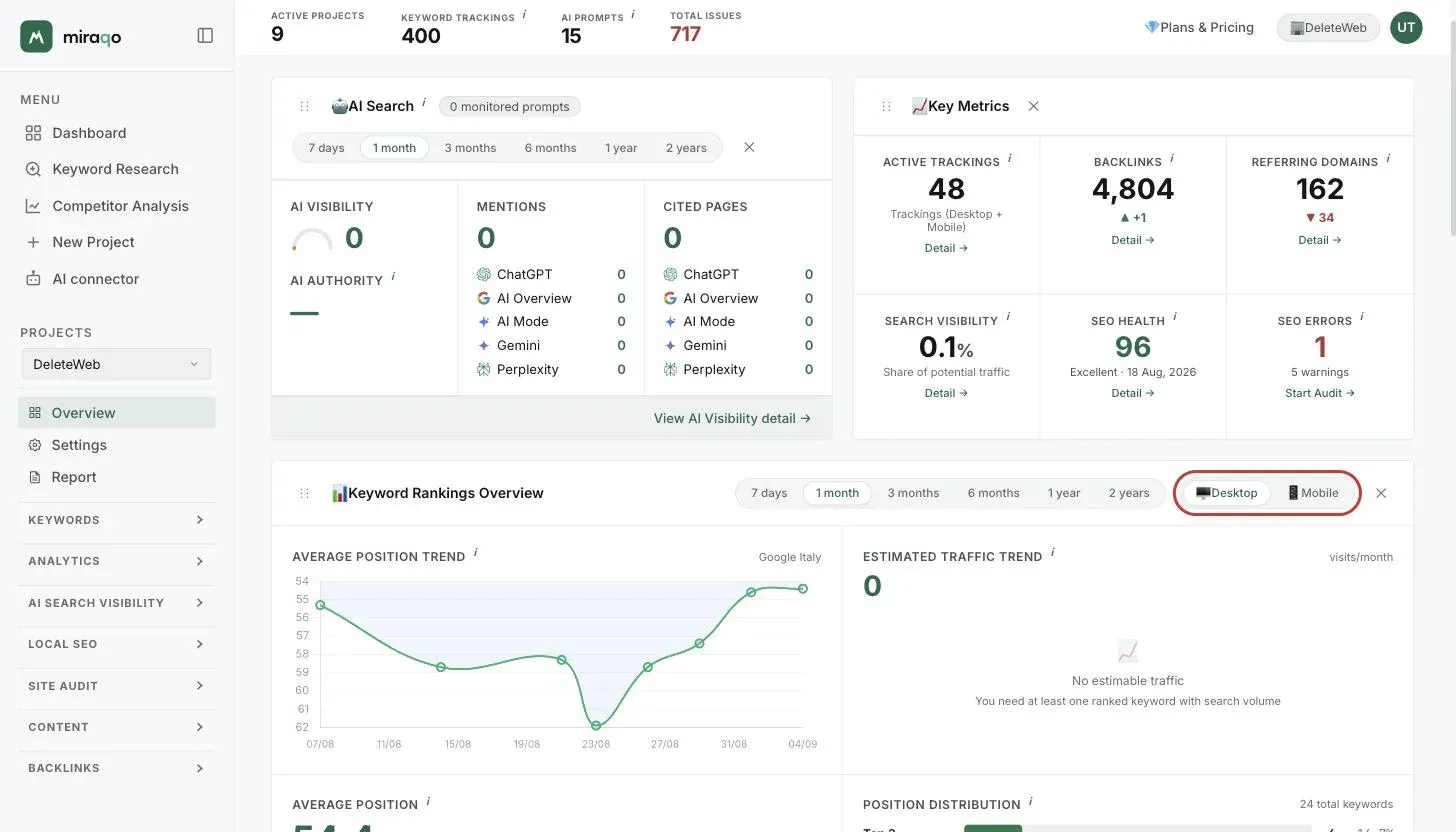
🤖 AI Search
Summarises the site’s visibility in AI assistants for the selected period (period selector top right of the widget):
- AI Visibility — 0–100 score with coloured ring; how often the domain appears in responses to monitored prompts
- Mentions — total brand citations + breakdown by platform (ChatGPT, Gemini, Perplexity, etc.) with source icons
- Cited pages — total site URLs referenced + breakdown by source
- AI Authority — 0–100 score of the brand’s authority in AI responses (see AI Visibility)
- Brand sentiment — under AI Authority, the donut with the share of positive, neutral and negative responses among those that name the brand, and the prevailing tone of each model. If the project has a GEO Audit, the GEO Audit of … row appears below with the models’ tone in the audit: it’s a separate source and is not added to the donut. With no responses that name the brand, instead of the donut you read “No AI answer mentions the brand yet.”
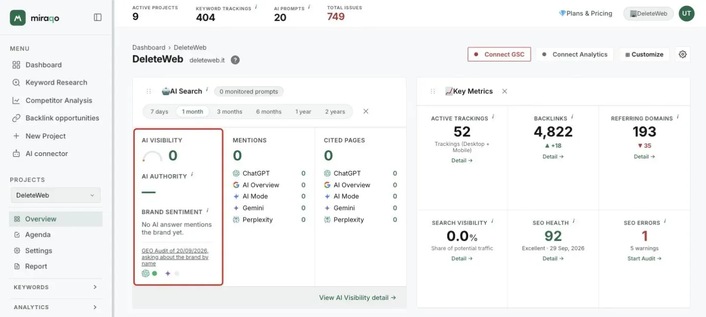
Configure prompts in the AI Visibility section (see Add AI Visibility prompts).
📈 Key Metrics
Six stat cards in a 3×2 grid with the project’s key figures:
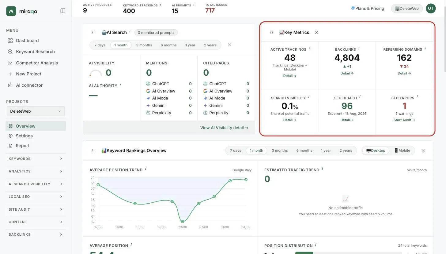
| Stat | What it is |
|---|---|
| Active trackings | Active trackings in the project: each keyword counts once per device (desktop + mobile) |
| Backlinks | Total incoming links + ▲▼ arrow with change vs previous period |
| Referring Domains | Distinct domains linking the site + change |
| Search Visibility | Estimated share of potential traffic (%) |
| SEO Health | 0–100 score from the latest audit (colour: green ≥80, yellow ≥60, orange ≥40, red <40) |
| SEO Errors | Critical errors (404 + missing titles + missing H1); below, count of warnings (missing description, duplicate title, noindex pages) |
If you’ve never run an audit, the last two cards show — and the link becomes “Start Audit →” (for enabled roles).
📊 Keyword Ranking Overview
The richest widget on the page, occupies half the width. Two selectors at the top:
- Period (week / 30 days / etc.)
- Device — 🖥️ Desktop or 📱 Mobile (changes all charts in this widget)
Row 1 — Trends
- Average Position Trend — line chart: inverted Y axis (#1 is at top), so a rising line = improvement
- Estimated Traffic Trend — chart + total estimated visits/month + ▲▼ change vs previous period
Row 2 — Statics
- Average Position — current average position + change; below, mini-counts Top 3 / Top 10 / Top 30 / Top 100 + “keywords outside Top 100”
- Position distribution — horizontal bars by band (Top 3, Top 10, etc.) with count and percentage
Row 3 — Lists
- Top 5 keywords by traffic — keyword, position, visits/month
- ▲ Improved — keywords that rose in position in the period
- ▼ Declined — keywords that fell in position
Row 4 — Opportunities
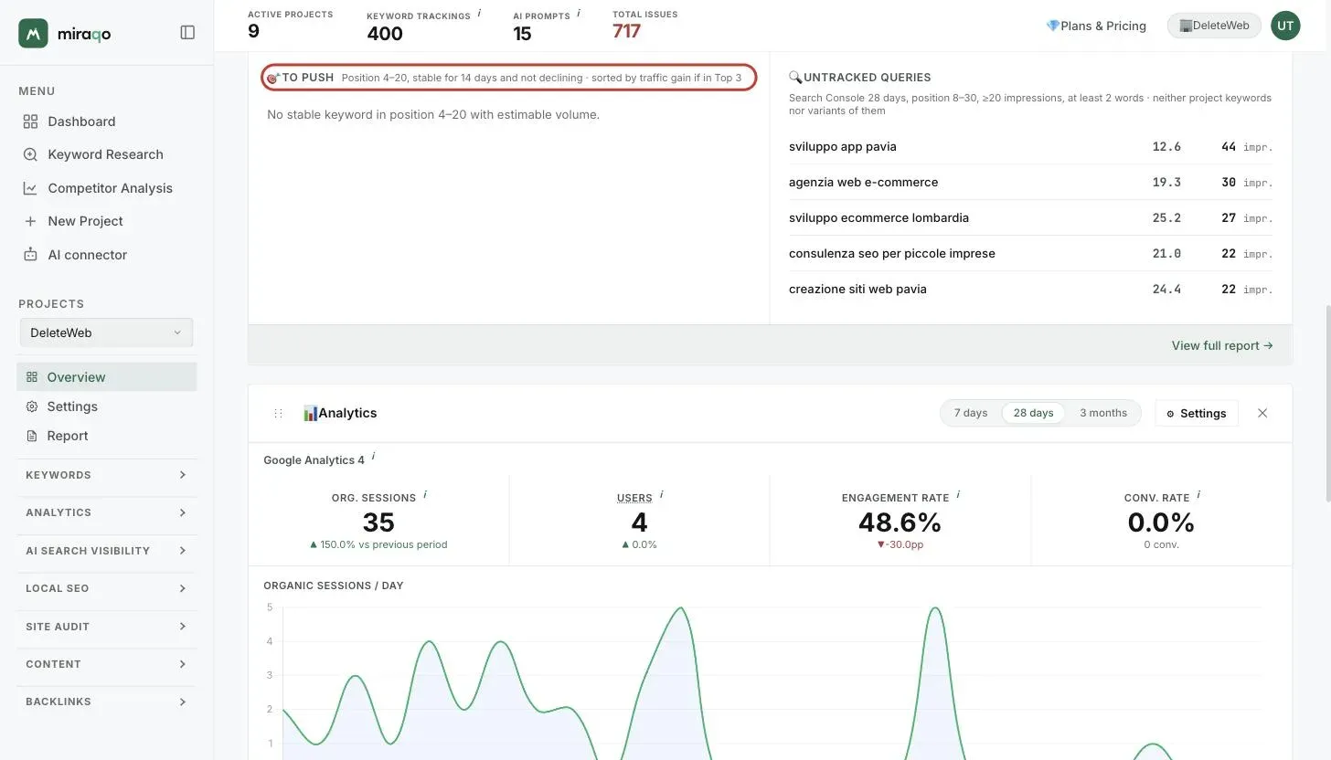
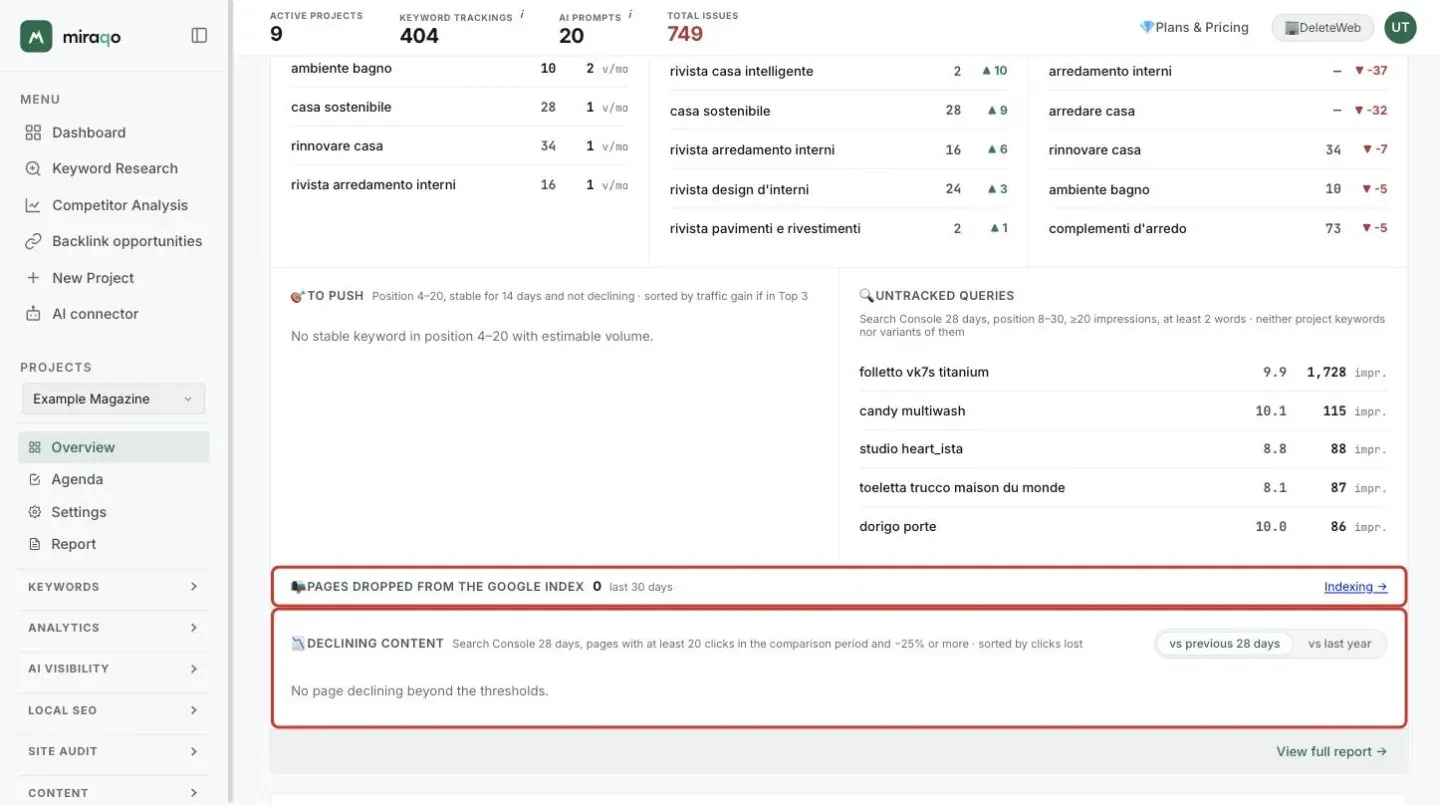
- 🎯 To push — keywords one step away from the top spots: position 4–20, estimable search volume, stable over the last 14 days (every check within 5 positions of the others) and not declining in the selected period. For each one you see current position, change over the period and the traffic gain (extra estimated visits/month if it reached the Top 3): the list is sorted by that gain, up to 5 entries. These are the natural candidates for an on-page or internal-linking tweak: little work, measurable return.
- 🔍 Untracked queries — requires a connected Search Console. Shows the queries the site already appears for on Google (last 28 days, average position 8–30, at least 20 impressions, at least 2 words) that are not among the project keywords nor simple variants of them (singular/plural, word order); the 5 with the most impressions. This list’s period is fixed and does not follow the widget selector. If a query matters to you, add it as a keyword and check on the Search Console page which page is serving it.
- 📉 Declining content — requires a connected Search Console. A row of its own below the two lists: the pages that lost at least 25% of their clicks over the last 28 days compared with the previous 28 days, with at least 20 clicks in the comparison period; the 5 that lost the most clicks, with the page’s main query under the URL and “clicks now / clicks before”. If the site has at least a year of Search Console data, a vs last year switch appears and compares the same 28 days of the previous year: that is the right comparison for seasonal sites, where a drop against the previous month is normal. The two periods are always isolated, never cumulative. New pages have no “before” and stay out; a page that disappeared from the results shows 0 clicks and −100%. This is where content refreshes start: open the page, compare it with whoever holds the top spots for that query today and update text, data and internal links.
Thresholds are fixed and stated in each list’s header: no composite score to interpret. When a list is empty, the message says which condition is not met (e.g. “No stable keyword in position 4–20 with estimable volume”).
View full report → link goes to the project detail.
📊 Analytics
Only visible if you’ve connected Google Analytics 4 or Matomo (see Connect Analytics). A separate section for each connected provider (if you have both GA4 and Matomo, you see both). For each provider:
- Organic Sessions — organic-source sessions in the period + % change vs previous period
- Users — users with at least one organic session. The ≈ symbol next to “Users” indicates an estimate (sum of daily users) when the deduplicated interval data isn’t available
- Engagement rate — % “engaged” sessions; “pp” indicates percentage point change
- Conv. rate — % sessions that generated a conversion; below, conversion count in the period
Organic sessions / day chart below the stats.
On Matomo, in this version, conversion attribution per landing page isn’t available: the card signals this with a note at the bottom.
🔗 Backlinks Check
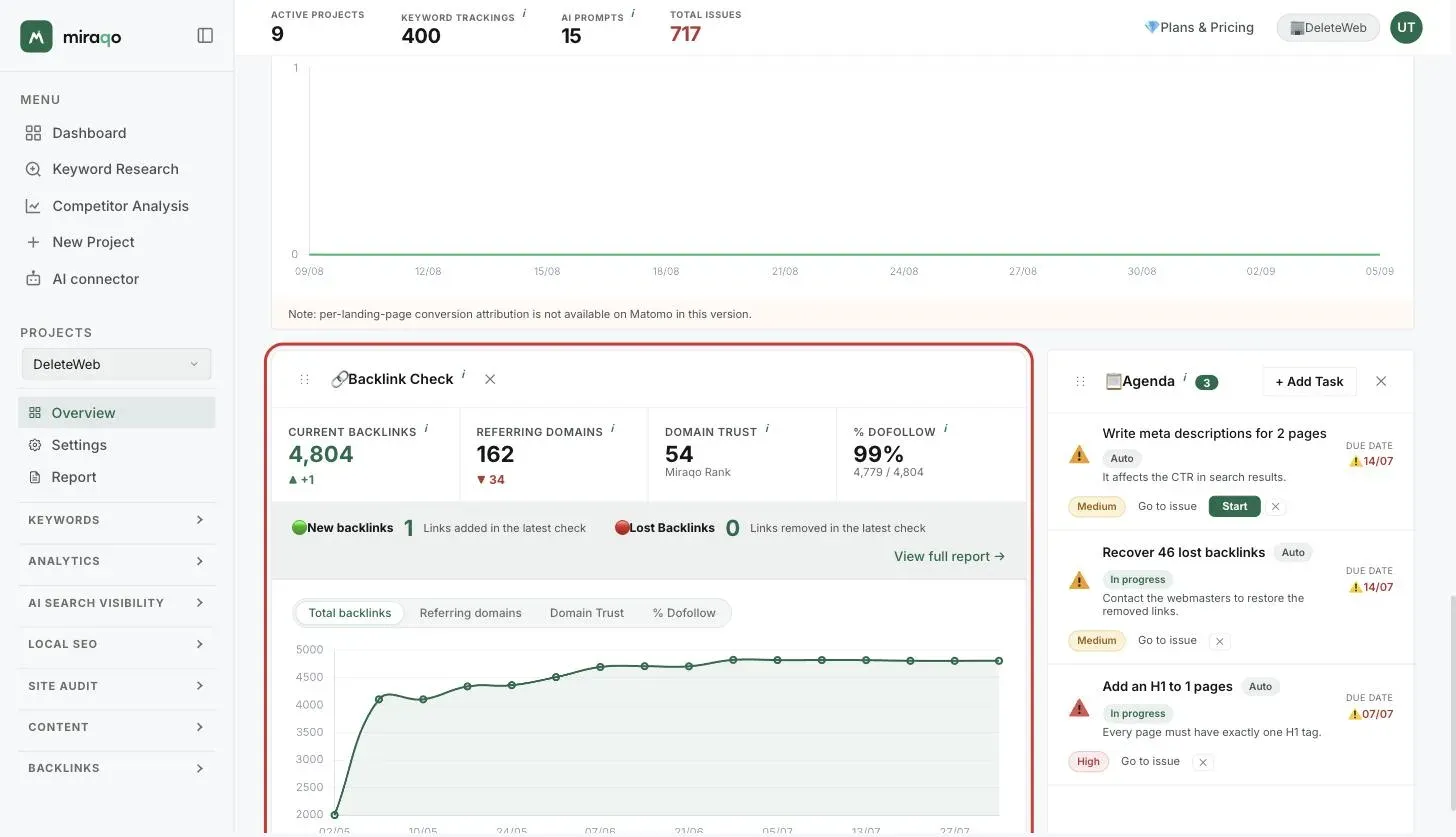
Only visible if there’s at least one backlink scan. Four stats in a row:
- Current Backlinks + change (links still present; lost ones excluded)
- Referring Domains + change
- Domain Trust (0–100) — domain authority score
- % Dofollow — share of links passing SEO authority
Below, a banner with 🟢 New backlinks and 🔴 Lost backlinks from the last detection, plus the View full report link. Then a historical chart with a metric selector: Total backlinks, Referring domains, Domain Trust, % Dofollow — one at a time, because the four scales aren’t comparable.
For the full detail see Backlinks analysis.
📋 Agenda
The first 8 things to do on the project. Auto tasks are suggested by Miraqo from the project’s data (keywords, audit, Search Console, indexing, competitors, backlinks), with priority and effort; the number next to the title shows open tasks.
Clicking + Add Task (visible to roles that can edit the project) opens a form with:
- Task description (required)
- Priority — 🔴 High / 🟡 Medium (default) / 🟢 Low
- Due date (optional)
- Notes (optional)
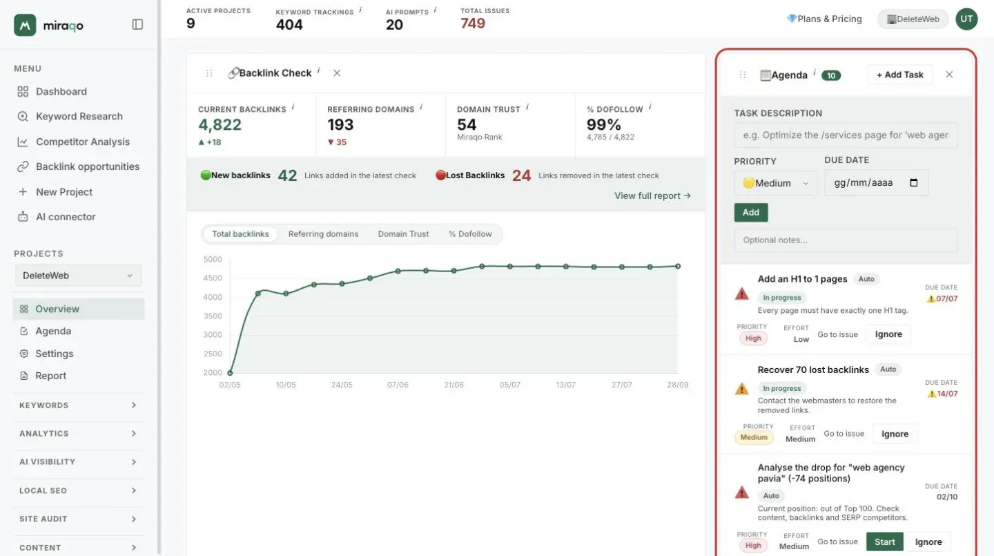
Click the icon on the left to complete a task, Ignore to hide it. Every task, with filters and progress, is on the Agenda page: see Agenda.
Where do I start?
If you’ve just created the project, the recommended path is:
As data arrives, the Overview fills up and becomes your daily starting point for the individual project.
Last updated: 29 September 2026